

Improving Trust, Rentention and Conversion
Improving Trust, Retention, and Conversion on Pricepally
Improving Trust, Retention, and Conversion on Pricepally
Redesigning a grocery e-commerce platform for a price-sensitive Nigerian market, from discovery to checkout.
I led the end-to-end redesign of Pricepally's shopping experience, fixing the friction that was quietly costing the business conversions, trust, and returning customers.
Redesigning a grocery e-commerce platform for a price-sensitive Nigerian market, from discovery to checkout.
I led the end-to-end redesign of Pricepally's shopping experience, fixing the friction that was quietly costing the business conversions, trust, and returning customers.
Company
Pricepally
Industry
E-commerce (Groceries)
Platforms
Web app, Mobile app
Role
Product Designer
Year
2025
Outcome
Outcome
End-to-end redesign of web and mobile shopping experience, covering product discovery, cart management, checkout flow, loyalty mechanics, and navigation, across both local and international store variants
End-to-end redesign of web and mobile shopping experience, covering product discovery, cart management, checkout flow, loyalty mechanics, and navigation, across both local and international store variants

Context & Opportunity
Context & Opportunity
Pricepally is a grocery e-commerce platform that owns its own inventory, controls pricing, and handles fulfillment. The model is clean on paper, no third-party sellers, no pricing noise, but the experience the product was delivering told a different story.
By the time I got deep into this work, the platform had grown. More SKUs, more store variants, more customers. But the interface hadn't kept up. What was manageable at a smaller scale became genuinely confusing at a larger one.
The gap wasn't the product. The gap was the experience around it.
Users were landing on a platform where they couldn't easily find what they were looking for, couldn't trust the pricing they were seeing, and didn't understand what they were getting before they checked out. For a grocery platform competing in a price-sensitive market, that's not a minor inconvenience. That's a revenue problem.
Pricepally is a grocery e-commerce platform that owns its own inventory, controls pricing, and handles fulfillment. The model is clean on paper, no third-party sellers, no pricing noise but the experience the product was delivering told a different story.
By the time I got deep into this work, the platform had grown. More SKUs, more store variants, more customers. But the interface hadn't kept up. What was manageable at a smaller scale became genuinely confusing at a larger one.
The gap wasn't the product. The gap was the experience around it.
Users were landing on a platform where they couldn't easily find what they were looking for, couldn't trust the pricing they were seeing, and didn't understand what they were getting before they checked out. For a grocery platform competing in a price-sensitive market, that's not a minor inconvenience. That's a revenue problem.


PricePally Before The Redesign
What I Was Solving
What I Was Solving
Shopping on Pricepally should have felt simple. You find what you need, you add it, you pay, it arrives. But across the journey, there were real points where users hesitated, got confused, or dropped off entirely.
The questions that kept surfacing from users and from the data were things like:
Why does this item show one price here and a different price at checkout?
I added things to my cart yesterday. Where did they go?
What's the difference between the local store and the international store?
I don't know what I'm getting until I've already committed.
Why is it so hard to just reorder what I bought last time?
And underneath all of those: do I trust this enough to put in my card details?
That was the real problem. Not any single flow in isolation. The platform had accumulated friction in enough places that it was eroding confidence especially for first-time users who had no prior relationship with the brand to fall back on.
Shopping on Pricepally should have felt simple. You find what you need, you add it, you pay, it arrives. But across the journey, there were real points where users hesitated, got confused, or dropped off entirely.
The questions that kept surfacing from users and from the data, were things like:
Why does this item show one price here and a different price at checkout?
I added things to my cart yesterday. Where did they go?
What's the difference between the local store and the international store?
I don't know what I'm getting until I've already committed.
Why is it so hard to just reorder what I bought last time?
And underneath all of those: do I trust this enough to put in my card details?
That was the real problem. Not any single flow in isolation. The platform had accumulated friction in enough places that it was eroding confidence, especially for first-time users who had no prior relationship with the brand to fall back on.

International store Homepage
International store Homepage
International store Homepage
What I Focused On First
What I Focused On First

Pricepally could have benefited from redesigns across dozens of touchpoints. That's not where I started.
I focused first on the moments that were doing the most damage: the places where users were actively deciding to leave or deciding to stay.
That meant:
clarifying how products were presented and priced before users got to cart
fixing the cart experience so it felt stable and trustworthy, not unpredictable
simplifying checkout to remove every unnecessary step and source of confusion
making navigation across store types intuitive, not something users had to decode
designing a mobile experience that matched how most people were actually shopping
I also looked at the longer arc, what would bring someone back a second time? That's where loyalty, gamification, and customizable lists came in. But the foundation had to come first.
Pricepally could have benefited from redesigns across dozens of touchpoints. That's not where I started.
I focused first on the moments that were doing the most damage: the places where users were actively deciding to leave or deciding to stay.
That meant:
clarifying how products were presented and priced before users got to cart
fixing the cart experience so it felt stable and trustworthy, not unpredictable
simplifying checkout to remove every unnecessary step and source of confusion
making navigation across store types intuitive, not something users had to decode
designing a mobile experience that matched how most people were actually shopping
I also looked at the longer arc, what would bring someone back a second time? That's where loyalty, gamification, and customizable lists came in. But the foundation had to come first.
I also looked at the longer arc, what would bring someone back a second time? That's where loyalty, gamification, and customizable lists came in. But the foundation had to come first.
What I Designed
What I Designed
1. Product Discovery & Homepage
The homepage was doing too many things at once. Two store variants (local and international) were presented in a way that confused users about which one applied to them. Promotions and featured items competed for attention without clear hierarchy.
I restructured the entry experience to give users a clearer sense of where they were and what was available to them. The local and international store variants became easier to understand and navigate between. Featured products were given proper visual weight, and discovery pathways, categories, search, recommendations were made more direct.
The goal was simple: land on the page, know where you are, find what you need.
1. Product Discovery & Homepage
The homepage was doing too many things at once. Two store variants (local and international) were presented in a way that confused users about which one applied to them. Promotions and featured items competed for attention without clear hierarchy.
I restructured the entry experience to give users a clearer sense of where they were and what was available to them. The local and international store variants became easier to understand and navigate between. Featured products were given proper visual weight, and discovery pathways, categories, search, recommendations were made more direct.
The goal was simple: land on the page, know where you are, find what you need.

Local store Homepage - Default View
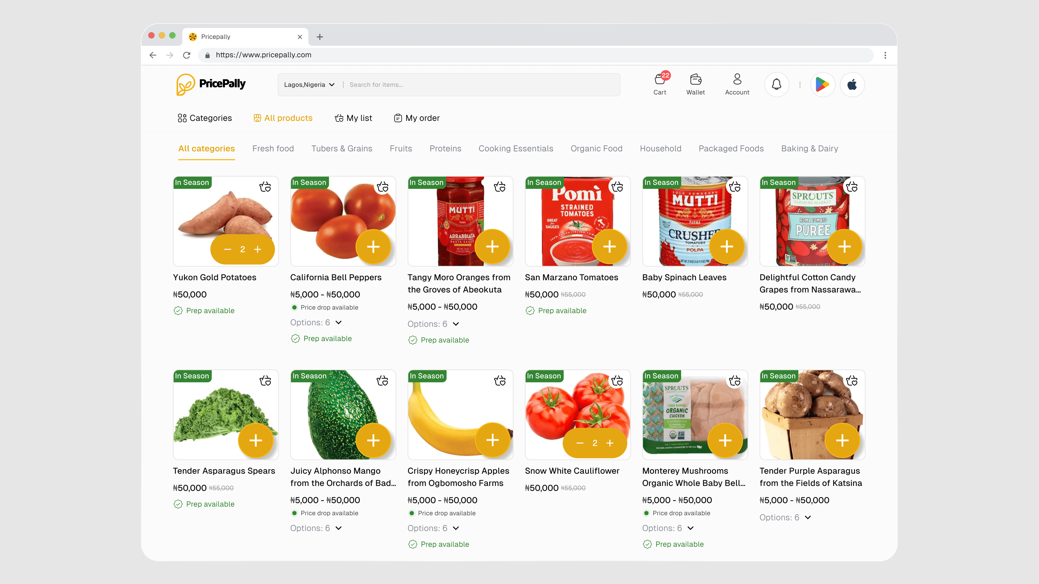
All products page

Adding products with multiple variant to cart
2. Product Detail & Pricing Clarity
Pricing had become a source of confusion. The platform had valid business reasons for how it structured costs, bulk pricing, delivery fees, quantity tiers, but those reasons weren't being communicated in a way users could follow.
I redesigned the product detail experience to surface pricing information in a way that felt honest rather than surprising. Unit pricing, quantity options, and total cost estimates were made visible before the user committed to adding anything to cart. Availability states in stock, low stock, out of stock were also made explicit at the product level rather than appearing only at checkout.
Users shouldn't have to get to the last step to find out if something is even available..
2. Product Detail & Pricing Clarity
Pricing had become a source of confusion. The platform had valid business reasons for how it structured costs, bulk pricing, delivery fees, quantity tiers, but those reasons weren't being communicated in a way users could follow.
I redesigned the product detail experience to surface pricing information in a way that felt honest rather than surprising. Unit pricing, quantity options, and total cost estimates were made visible before the user committed to adding anything to cart. Availability states in stock, low stock, out of stock were also made explicit at the product level rather than appearing only at checkout.
Users shouldn't have to get to the last step to find out if something is even available..

Product details page

Shopping mode

Customizable bundles
Local store Homepage - Default View
Product details page
3. Cart Management
The cart was a particular problem. Users would build a basket, step away, come back and find things had changed or disappeared. Recommendations were absent. There was no structure to help users feel like the cart was a reliable holding space.
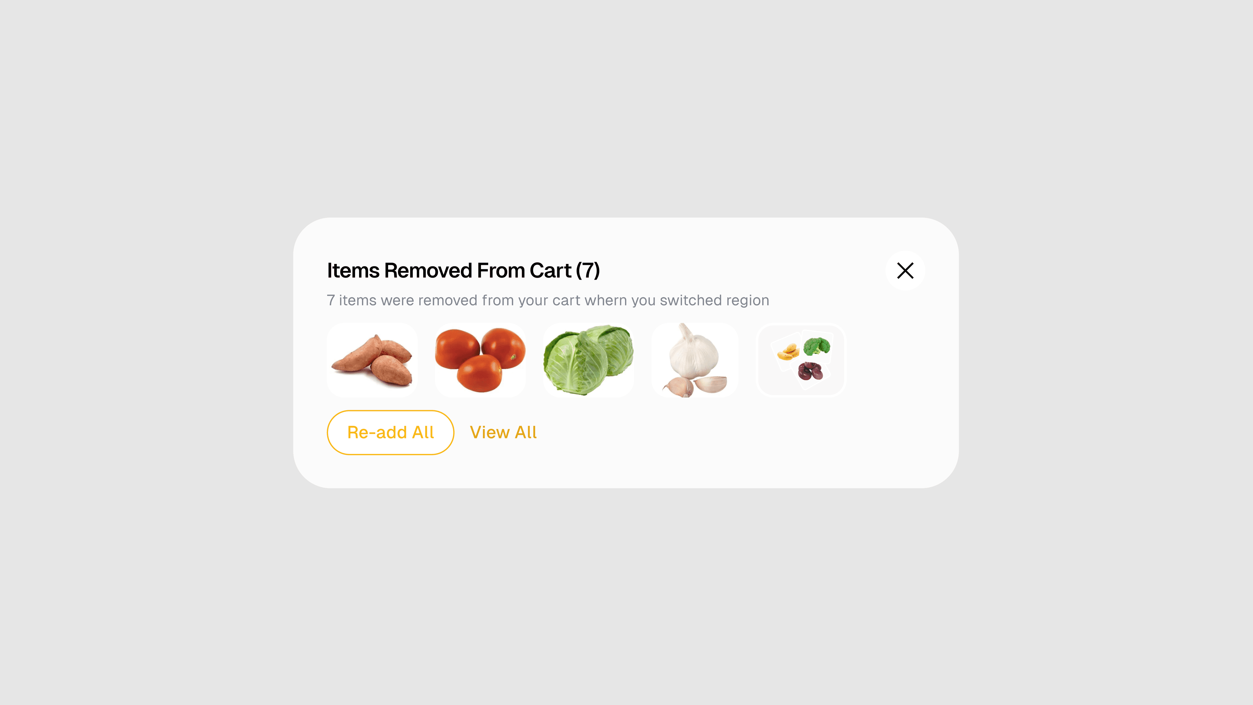
I redesigned the cart to feel more stable. Saved items, clear quantity controls, visible pricing summaries, and contextual recommendations (based on what was already in the cart) gave users more confidence that their choices were being held and that the total they were seeing was the total they'd pay.
I also introduced the foundation for customizable lists a way for returning users to save recurring grocery orders and reactivate them without rebuilding from scratch each time. For a grocery platform, repeat purchasing is the whole game. This was a meaningful step toward making that easier.
3. Cart Management
The cart was a particular problem. Users would build a basket, step away, come back and find things had changed or disappeared. Recommendations were absent. There was no structure to help users feel like the cart was a reliable holding space.
I redesigned the cart to feel more stable. Saved items, clear quantity controls, visible pricing summaries, and contextual recommendations (based on what was already in the cart) gave users more confidence that their choices were being held and that the total they were seeing was the total they'd pay.
I also introduced the foundation for customizable lists a way for returning users to save recurring grocery orders and reactivate them without rebuilding from scratch each time. For a grocery platform, repeat purchasing is the whole game. This was a meaningful step toward making that easier.
Adding products with multiple variant to cart
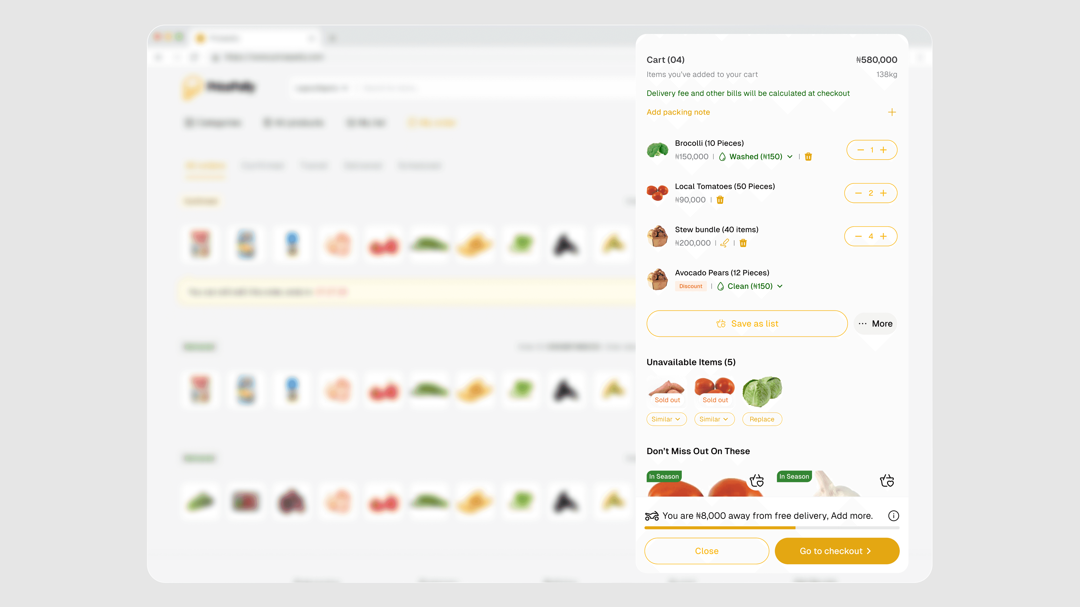
Cart systen, showing items dropped and recommendations

List creation

Adding items to list

Items added to list

Manage list Page
4. Checkout Flow
Checkout abandonment was sitting at 40% before the redesign. That number tells you there's a specific moment or a series of moments where users are deciding the effort isn't worth it.
I stripped the checkout flow back to its essential steps and removed every point of unnecessary decision-making. Payment options were made clearer. Delivery details were easier to complete. The order summary stayed visible throughout, so users never had to guess what they were about to pay.
The redesigned flow reduced abandonment from 40% to 15%.

Checkout page

Checkout page

Payment screen

Success screen
Shopping mode
Customizable bundles
Cart systen, showing items dropped and recommendations
5. Loyalty & Gamification
Once the core experience was cleaner, I looked at what would give users a reason to come back.
I introduced a loyalty layer points, purchase milestones, and rewards tied to shopping behaviour that gave returning customers a sense of progress and a reason to keep their purchases on Pricepally rather than spreading them across alternatives. The gamification elements were designed to feel natural to the shopping experience, not bolted on.
List creation

Level based gamification

Earning details

Referral dashboard
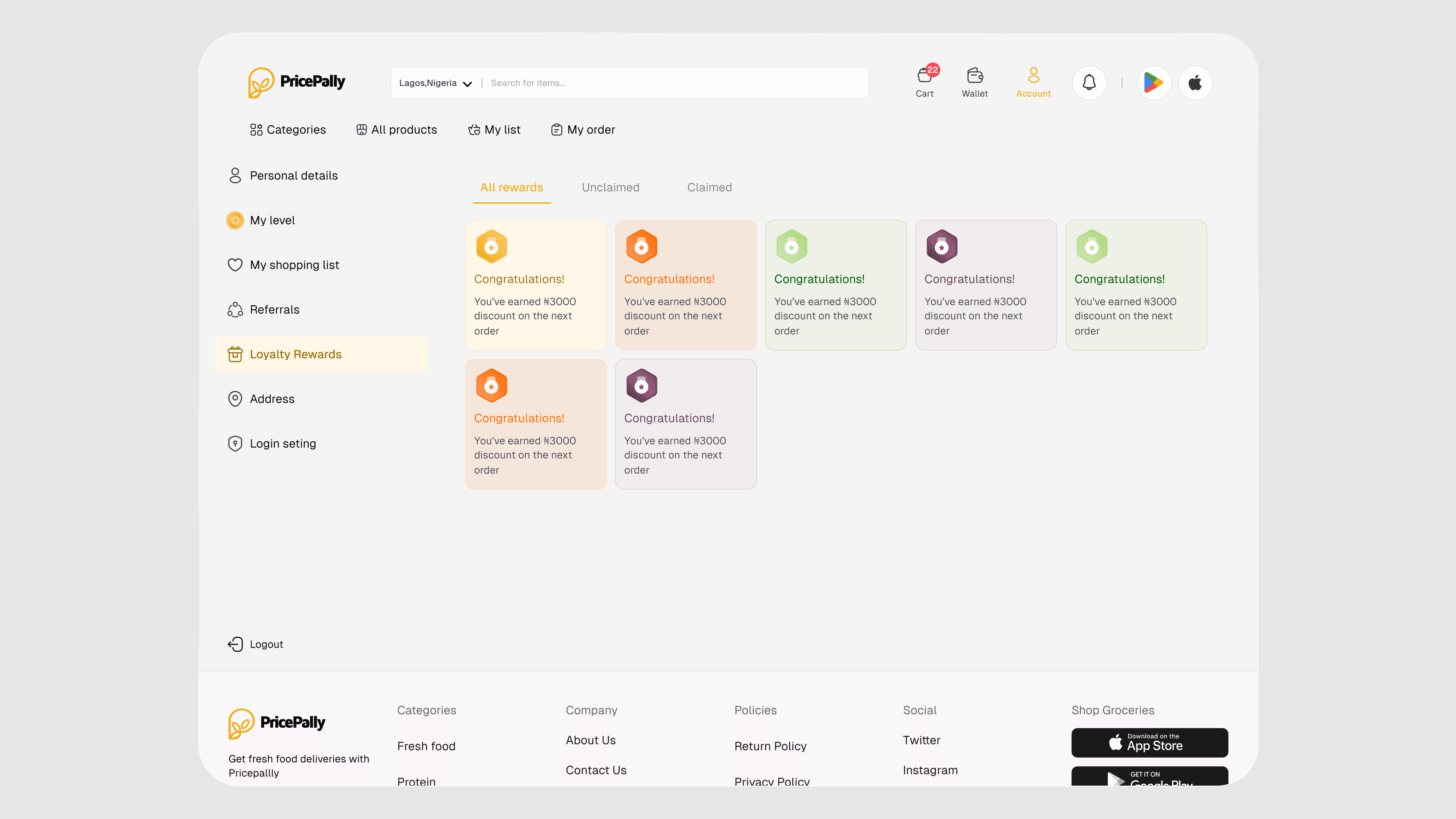
Loyalty reward dashboard
Adding items to list
Items added to list
Checkout page
Manage list Page
Checkout page
Payment screen
Level based gamification
Success screen
All product page
6. Mobile Application
Even though the web was a major traffic source, data showed that 40% of Pricepally's users were shopping on mobile. That meant the mobile app wasn't a secondary concern, it was where the most of the experience actually lived.
After completing the web redesign, I moved directly into mobile with the same priorities: find what you need, understand what you're getting, complete the purchase without friction. On a smaller screen, every decision about hierarchy, tap targets, and information density matters more. I made sure the mobile experience didn't just mirror the web design, it was built for how people actually use their phones to shop.

Results
Conversion rate improved by 45%
Checkout abandonment reduced from 40% to 15%
User retention increased by 35% within 3 months
Session duration increased by 20%
Customer satisfaction - 90% of surveyed users preferred the redesigned experience
Results
Conversion rate improved by 45%
Checkout abandonment reduced from 40% to 15%
User retention increased by 35% within 3 months
Session duration increased by 20%
Customer satisfaction - 90% of surveyed users preferred the redesigned experience
Product details page
Local store Homepage - Default view
Shopping mode
Earning details
Referral dashboard
Loyalty reward dashboard
Customizable bundles
Adding products with multiple variant to cart
List creation
Adding items to list
Items added to list
Checkout page
Manage list Page
Checkout page
Payment screen
Level based gamification
Success screen
Earning details
Referral dashboard
Loyalty reward dashboard
Cart systen, showing items dropped and recommendations
All product page
Swipe images to view mobile designs
Swipe images to view mobile designs
What I Learned
What I Learned
Pricepally reminded me that the problems worth solving aren't always the most visible ones. The platform's biggest challenge wasn't that it looked outdated. It was that trust was quietly being eroded at multiple points across the journey in the pricing, in the cart, in the checkout and no single fix was going to solve it. The work that moved the numbers was incremental and interconnected. Making pricing legible helped. Stabilizing the cart helped. Simplifying checkout helped. None of those improvements would have been as effective in isolation. The most useful thing I brought to this project was the willingness to treat the full journey as the product not just the individual screens.
Pricepally reminded me that the problems worth solving aren't always the most visible ones. The platform's biggest challenge wasn't that it looked outdated. It was that trust was quietly being eroded at multiple points across the journey in the pricing, in the cart, in the checkout and no single fix was going to solve it. The work that moved the numbers was incremental and interconnected. Making pricing legible helped. Stabilizing the cart helped. Simplifying checkout helped. None of those improvements would have been as effective in isolation. The most useful thing I brought to this project was the willingness to treat the full journey as the product not just the individual screens.
