
Enterprise-grade design systems & UI kits ( Angular & React Framework compatible)
Angular & React Framework compatible
Building the Design System That Designers Build Everything Else With.
Building the Design System That Designers Build Everything Else With.
Contributing to Frames X, the world's largest Figma UI kit and design system, used by over 4,500 designers and teams globally.
Contributing to Frames X, the world's largest Figma UI kit and design system, used by over 4,500 designers and teams globally.
Client
Frame X
Category
Design System
Platforms
Figma, Angular & React Framework Compatible
Role
Product designer
Year
2023
The Project That Taught Me What a Design System Really Is
There's a version of a design system that's a collection of components in a shared Figma file. Consistent buttons, a colour palette, some text styles. It solves a coordination problem and saves a team from reinventing their checkbox for the fourth time.
And then there's what Frames X is.
Frames X is a design system in the truest sense an opinionated, deeply considered infrastructure for building anything. It's not a shortcut. It's a foundation. The kind of thing where every decision, from how a token is named to how a component handles its disabled state, is made with the full weight of scale in mind. When your work is going to be used by thousands of designers, on thousands of different products, the cost of a wrong decision compounds in ways a private team system never has to reckon with.
Working on Frames X put me inside that reckoning. And it changed how I think about design systems permanently.
There's a version of a design system that's a collection of components in a shared Figma file. Consistent buttons, a colour palette, some text styles. It solves a coordination problem and saves a team from reinventing their checkbox for the fourth time.
And then there's what Frames X is.
Frames X is a design system in the truest sense an opinionated, deeply considered infrastructure for building anything. It's not a shortcut. It's a foundation. The kind of thing where every decision, from how a token is named to how a component handles its disabled state, is made with the full weight of scale in mind. When your work is going to be used by thousands of designers, on thousands of different products, the cost of a wrong decision compounds in ways a private team system never has to reckon with.
Working on Frames X put me inside that reckoning. And it changed how I think about design systems permanently.

Work Scope
Component design, design tokens & variables, UI kit architecture, dark mode, responsive systems, interactive states, and developer handoff via React and Angular compatibility
Component design, design tokens & variables, UI kit architecture, dark mode, responsive systems, interactive states, and developer handoff via React and Angular compatibility
What Frames X Actually Is
Before I describe what I worked on, it helps to understand what Frames X is trying to do, because it's more ambitious than most designers realise when they first encounter it.
At its surface, Frames X is a Figma UI kit. Over 3,500 components across 80+ web design categories. Dashboards, charts, forms, tables, navigation, e-commerce, settings, kanban boards, mail apps, AI interfaces, the breadth is genuinely unusual. Most UI kits pick a lane. Frames X chose to be comprehensive.
But the component count is the least interesting part.
What makes Frames X a real design system rather than just a large component library is the parametric token architecture underneath it. Every component is connected to a system of Figma variables that controls colour, typography, spacing, radius, and shadow across the entire kit simultaneously. Change a token value and the change propagates everywhere it's referenced. Light mode, dark mode, brand colour, type scale, all of it adjustable through the variable system without touching a single component directly.
The system also ships a .json token file for direct sync with development, so the design tokens and the code tokens are the same tokens, named with code syntax in Dev Mode. The gap between design and production that most teams live with permanently is one of the things Frames X was explicitly built to close. It has Angular and React component libraries that mirror the Figma system, which means a designer and a developer working from Frames X are genuinely working from the same source of truth.
That's the system I was working inside.
Before I describe what I worked on, it helps to understand what Frames X is trying to do, because it's more ambitious than most designers realise when they first encounter it.
At its surface, Frames X is a Figma UI kit. Over 3,500 components across 80+ web design categories. Dashboards, charts, forms, tables, navigation, e-commerce, settings, kanban boards, mail apps, AI interfaces, the breadth is genuinely unusual. Most UI kits pick a lane. Frames X chose to be comprehensive.
But the component count is the least interesting part.
What makes Frames X a real design system rather than just a large component library is the parametric token architecture underneath it. Every component is connected to a system of Figma variables that controls colour, typography, spacing, radius, and shadow across the entire kit simultaneously. Change a token value and the change propagates everywhere it's referenced. Light mode, dark mode, brand colour, type scale, all of it adjustable through the variable system without touching a single component directly.
The system also ships a .json token file for direct sync with development, so the design tokens and the code tokens are the same tokens, named with code syntax in Dev Mode. The gap between design and production that most teams live with permanently is one of the things Frames X was explicitly built to close. It has Angular and React component libraries that mirror the Figma system, which means a designer and a developer working from Frames X are genuinely working from the same source of truth.
That's the system I was working inside.


What I Worked On

Component Design & Variant Architecture
Component Design & Variant Architecture
My primary contribution was in the component layer, designing, structuring, and stress-testing components so they held up across the full range of contexts they'd need to serve.
Frames X components aren't designed for a single product. They're designed to be used by a freelancer building a client landing page, an enterprise team building a SaaS dashboard, and a startup building a mobile-first consumer app, sometimes all with the same set of components. That constraint requires a different way of thinking about variants.
The variant and property architecture had to be expressive enough to cover real design needs without becoming so complex that a designer using the kit would spend more time navigating the component than placing it. Every component I worked on was evaluated against that balance: how many configurations does this actually need, and which ones can be handled by composition rather than enumeration?
Interactive states were a particular focus. Frames X components include built-in hover, focused, active, and disabled states for use in prototyping, which meant every component needed to be built with interaction in mind from the start, not patched with states after the fact. I designed to that standard throughout, building state variants into the component structure rather than treating them as additions.
My primary contribution was in the component layer, designing, structuring, and stress-testing components so they held up across the full range of contexts they'd need to serve.
Frames X components aren't designed for a single product. They're designed to be used by a freelancer building a client landing page, an enterprise team building a SaaS dashboard, and a startup building a mobile-first consumer app, sometimes all with the same set of components. That constraint requires a different way of thinking about variants.
The variant and property architecture had to be expressive enough to cover real design needs without becoming so complex that a designer using the kit would spend more time navigating the component than placing it. Every component I worked on was evaluated against that balance: how many configurations does this actually need, and which ones can be handled by composition rather than enumeration?
Interactive states were a particular focus. Frames X components include built-in hover, focused, active, and disabled states for use in prototyping, which meant every component needed to be built with interaction in mind from the start, not patched with states after the fact. I designed to that standard throughout, building state variants into the component structure rather than treating them as additions.


Design Tokens & Variables
Design Tokens & Variables
The token system in Frames X is what separates it from every UI kit that came before it in the Figma ecosystem. Working on the variable architecture was the part of this project I found most technically demanding and most rewarding.
Frames X uses a layered token model: primitive tokens define the raw values (a specific hex, a specific spacing unit), semantic tokens reference those primitives and give them meaning in context (a --color-surface-primary token that references --color-neutral-50), and component tokens reference the semantic layer for precise component-level control.
What this model makes possible is remarkable. A designer can swap an entire brand, colours, type scale, radius, shadow, by updating a single collection of primitive tokens. The semantic layer translates those changes into the right component behaviour without requiring manual updates. A team building a white-label product can use Frames X as their foundation and ship multiple branded variants from the same component set with almost no duplication.
I worked on defining scoping rules for the token system, making sure variables were scoped to the contexts where they were meaningful rather than applied globally where they'd create noise. Figma's variable scoping is a relatively new capability and one that significantly affects the experience of working with a variable system in practice. Getting scoping right meant designers using the kit would see only the relevant tokens in the right contexts, rather than scrolling through a flat list trying to find the one they needed.
The token system in Frames X is what separates it from every UI kit that came before it in the Figma ecosystem. Working on the variable architecture was the part of this project I found most technically demanding and most rewarding.
Frames X uses a layered token model: primitive tokens define the raw values (a specific hex, a specific spacing unit), semantic tokens reference those primitives and give them meaning in context (a --color-surface-primary token that references --color-neutral-50), and component tokens reference the semantic layer for precise component-level control.
What this model makes possible is remarkable. A designer can swap an entire brand, colours, type scale, radius, shadow, by updating a single collection of primitive tokens. The semantic layer translates those changes into the right component behaviour without requiring manual updates. A team building a white-label product can use Frames X as their foundation and ship multiple branded variants from the same component set with almost no duplication.
I worked on defining scoping rules for the token system, making sure variables were scoped to the contexts where they were meaningful rather than applied globally where they'd create noise. Figma's variable scoping is a relatively new capability and one that significantly affects the experience of working with a variable system in practice. Getting scoping right meant designers using the kit would see only the relevant tokens in the right contexts, rather than scrolling through a flat list trying to find the one they needed.


Dark Mode Architecture
Dark Mode Architecture
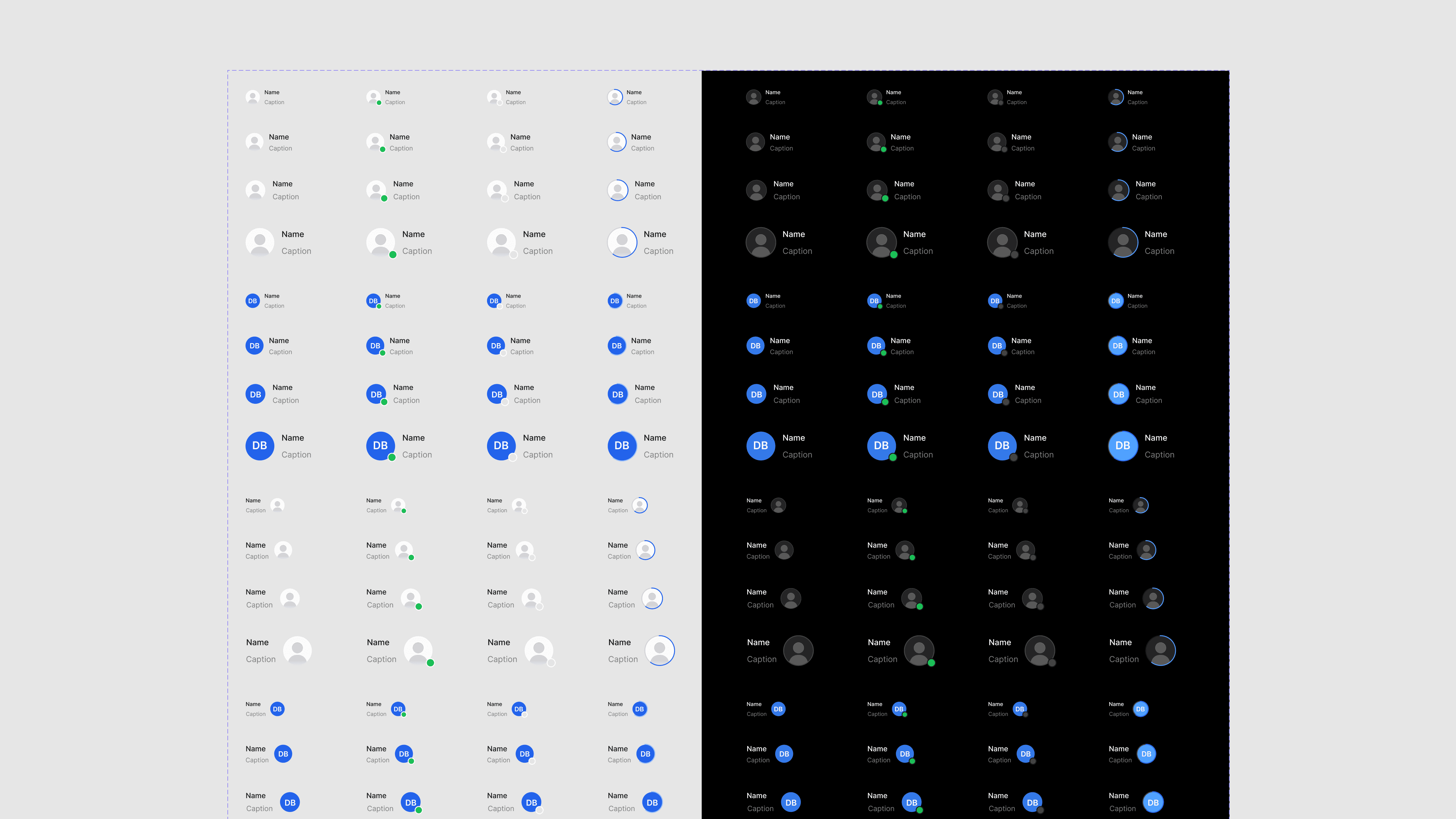
Dark mode in Frames X isn't a second colour palette applied over the light version. It's a first-class system built into the token architecture from the ground up.
The semantic token layer is what makes this possible. Components don't reference raw colour values, they reference semantic tokens like --color-text-primary or --color-border-default. In the light mode collection, those tokens resolve to light values. In the dark mode collection, they resolve to dark values. The component itself doesn't change. The mode switches.
Designing for this required thinking carefully about which semantic roles needed distinct dark mode values and which could share values across modes. It also required testing every component in dark mode during design, not as a final check, but as part of the design process itself. A component that looks right in light mode and broken in dark mode was a component with a token architecture problem, not a cosmetic one.
I stress-tested components in dark mode throughout the process, treating dark mode quality as a design constraint equal to light mode, not an afterthought.
Dark mode in Frames X isn't a second colour palette applied over the light version. It's a first-class system built into the token architecture from the ground up.
The semantic token layer is what makes this possible. Components don't reference raw colour values, they reference semantic tokens like --color-text-primary or --color-border-default. In the light mode collection, those tokens resolve to light values. In the dark mode collection, they resolve to dark values. The component itself doesn't change. The mode switches.
Designing for this required thinking carefully about which semantic roles needed distinct dark mode values and which could share values across modes. It also required testing every component in dark mode during design, not as a final check, but as part of the design process itself. A component that looks right in light mode and broken in dark mode was a component with a token architecture problem, not a cosmetic one.
I stress-tested components in dark mode throughout the process, treating dark mode quality as a design constraint equal to light mode, not an afterthought.


Typography Variables
Typography Variables
Typography in Frames X is handled through a parametric variable system that controls typeface, size scale, line height, letter spacing, and weight across the full kit. Changing the base type variables cascades through every text element in every component, headings, labels, body copy, captions, code blocks, simultaneously.
Working on the typography variable system required thinking about scalability in two directions: across screen sizes (the type scale needed to remain legible and proportionally correct at mobile, tablet, and desktop breakpoints) and across product types (a SaaS dashboard uses type differently from a marketing website, and the system needed to accommodate both without breaking).
I worked on the responsive type logic, how scale steps adjusted at different breakpoints and on making the variable system approachable for designers who were using Figma variables seriously for the first time. Clear naming, clean organisation, and documentation within the component itself were all part of the work.
Typography in Frames X is handled through a parametric variable system that controls typeface, size scale, line height, letter spacing, and weight across the full kit. Changing the base type variables cascades through every text element in every component, headings, labels, body copy, captions, code blocks, simultaneously.
Working on the typography variable system required thinking about scalability in two directions: across screen sizes (the type scale needed to remain legible and proportionally correct at mobile, tablet, and desktop breakpoints) and across product types (a SaaS dashboard uses type differently from a marketing website, and the system needed to accommodate both without breaking).
I worked on the responsive type logic, how scale steps adjusted at different breakpoints and on making the variable system approachable for designers who were using Figma variables seriously for the first time. Clear naming, clean organisation, and documentation within the component itself were all part of the work.

Responsive Layout System
Responsive Layout System
Typography in Frames X is handled through a parametric variable system that controls typeface, size scale, line height, letter spacing, and weight across the full kit. Changing the base type variables cascades through every text element in every component, headings, labels, body copy, captions, code blocks, simultaneously.
Working on the typography variable system required thinking about scalability in two directions: across screen sizes (the type scale needed to remain legible and proportionally correct at mobile, tablet, and desktop breakpoints) and across product types (a SaaS dashboard uses type differently from a marketing website, and the system needed to accommodate both without breaking).
I worked on the responsive type logic, how scale steps adjusted at different breakpoints and on making the variable system approachable for designers who were using Figma variables seriously for the first time. Clear naming, clean organisation, and documentation within the component itself were all part of the work.
Typography in Frames X is handled through a parametric variable system that controls typeface, size scale, line height, letter spacing, and weight across the full kit. Changing the base type variables cascades through every text element in every component, headings, labels, body copy, captions, code blocks, simultaneously.
Working on the typography variable system required thinking about scalability in two directions: across screen sizes (the type scale needed to remain legible and proportionally correct at mobile, tablet, and desktop breakpoints) and across product types (a SaaS dashboard uses type differently from a marketing website, and the system needed to accommodate both without breaking).
I worked on the responsive type logic, how scale steps adjusted at different breakpoints and on making the variable system approachable for designers who were using Figma variables seriously for the first time. Clear naming, clean organisation, and documentation within the component itself were all part of the work.

The Discipline of Designing at Scale
The thing that changed most about how I work after this project is how I evaluate a design decision.
On a product team, the question is usually: does this work for our users, on our product, with our constraints? That's a specific, bounded question. It has a knowable answer.
On a design system that ships to thousands of teams, the question is: does this work for every user, on every product, with every possible constraint? That question doesn't have a clean answer. What it has is a set of principles that guide you toward decisions that are more likely to hold.
The principles I carried through this project were:
The thing that changed most about how I work after this project is how I evaluate a design decision.
On a product team, the question is usually: does this work for our users, on our product, with our constraints? That's a specific, bounded question. It has a knowable answer.
On a design system that ships to thousands of teams, the question is: does this work for every user, on every product, with every possible constraint? That question doesn't have a clean answer. What it has is a set of principles that guide you toward decisions that are more likely to hold.
The principles I carried through this project were:
Composability over comprehensiveness
Composability over comprehensiveness
A system that covers fewer things well is more useful than one that covers everything poorly. Every component should do its job cleanly and combine well with other components rather than trying to handle every edge case internally.
A system that covers fewer things well is more useful than one that covers everything poorly. Every component should do its job cleanly and combine well with other components rather than trying to handle every edge case internally.
Tokens over hardcoded values.
Tokens over hardcoded values.
Every design decision that could reasonably need to change colour, spacing, radius, shadow, type, belongs in the token system, not in the component. This isn't perfectionism. It's the practical difference between a system you can maintain and one that collapses when a brand colour changes.
Every design decision that could reasonably need to change colour, spacing, radius, shadow, type, belongs in the token system, not in the component. This isn't perfectionism. It's the practical difference between a system you can maintain and one that collapses when a brand colour changes.
Naming is design
Naming is design
The name of a token, a component, a variant is a design decision with real consequences for the people using the system. A poorly named token creates friction every time someone has to choose between it and three others that seem similar. I gave naming the same attention I gave visual design. Had to avoid functional naming, this made naming consistent and remove the guesswork when searching for a variable in a group.
The name of a token, a component, a variant is a design decision with real consequences for the people using the system. A poorly named token creates friction every time someone has to choose between it and three others that seem similar. I gave naming the same attention I gave visual design. Had to avoid functional naming, this made naming consistent and remove the guesswork when searching for a variable in a group.

Dark mode is not a feature, it's a test
Dark mode is not a feature, it's a test
If a component works in dark mode without modification, the token architecture is correct. If it doesn't, there's a structural problem to fix, not an appearance problem to patch.
If a component works in dark mode without modification, the token architecture is correct. If it doesn't, there's a structural problem to fix, not an appearance problem to patch.
What This Work Added to Everything Else
Working on Frames X didn't make me a better component designer in isolation. It made me a better product designer, full stop.
Every product I've worked on since has benefited from the discipline this project required. The way I think about tokens now shapes how I set up any Figma file, even for a single-product team. The way I think about variant architecture now means I build components with less redundancy and more flexibility than I did before. The understanding I developed of what makes a design-to-development handoff actually work, shared naming, shared structure, no translation required, has changed how I collaborate with engineers on every project.
The best design systems are invisible. Designers using Frames X shouldn't think about the system, they should just find what they need, use it, and ship. Getting to invisible requires an enormous amount of visible work. I got to be part of that work, and it's something I bring to everything I do now.
Working on Frames X didn't make me a better component designer in isolation. It made me a better product designer, full stop.
Every product I've worked on since has benefited from the discipline this project required. The way I think about tokens now shapes how I set up any Figma file, even for a single-product team. The way I think about variant architecture now means I build components with less redundancy and more flexibility than I did before. The understanding I developed of what makes a design-to-development handoff actually work, shared naming, shared structure, no translation required, has changed how I collaborate with engineers on every project.
The best design systems are invisible. Designers using Frames X shouldn't think about the system, they should just find what they need, use it, and ship. Getting to invisible requires an enormous amount of visible work. I got to be part of that work, and it's something I bring to everything I do now.

Available for new projects
Ready to start?
Let's chat.